Best Colors for a Resume
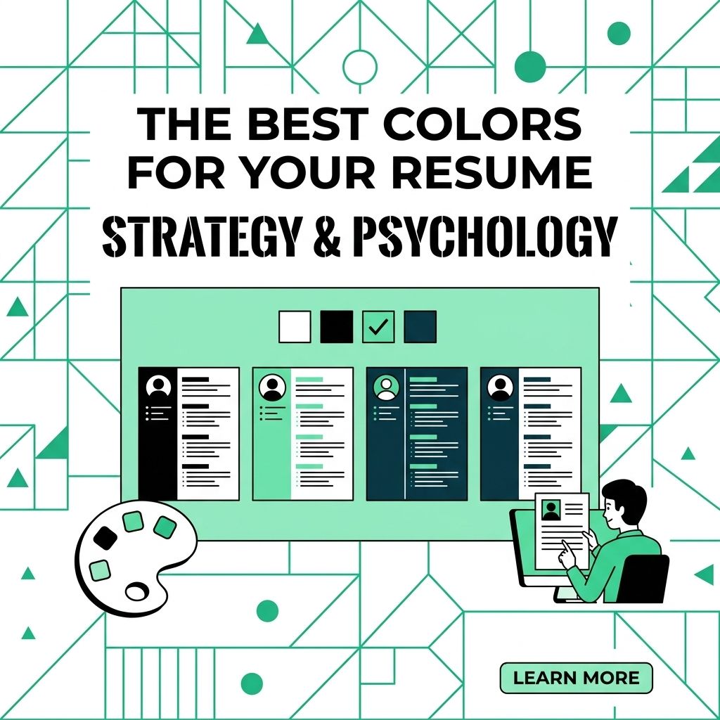
Color can work on a resume, but it should never make the document harder to read. Use color as a small accent, not the main event.
Black text on a white or light background is still the safest base. Add color only when it improves structure.
Resume Readability Comes First
CareerOneStop's resume formatting guide recommends basic fonts, consistent spacing, and standard section headings. That same principle applies to color. Keep the resume easy to scan.
Contrast matters
Use dark text for body content. Avoid pale gray, neon, low-contrast colors, or colored paragraph text.
- Input: Navy section headers and thin divider lines.
- Output: Clear structure without hurting readability.
- Input: Pale green body text or bright yellow bullets.
- Output: Harder reading and weaker contrast.
Simple color framework
Keep the palette small.
- Base color: White or a very light neutral background.
- Text color: Black or dark charcoal.
- Accent color: One restrained color for headers, lines, or your name.
Choose an Accent Color
Pick a color that fits the role and still reads well. The industry matters less than clarity.
Use Color Without Hurting the Resume
Keep the accent color controlled.
- Keep body text dark: Do not use accent colors for paragraphs or bullet descriptions.
- Use color for structure: Apply it to section headings, your name, or divider lines.
- Match other materials: Use the same accent on your cover letter or portfolio when it fits.
- Test the print version: Print in grayscale and make sure the sections still read clearly.
Creative fields allow more room for style, but readability still wins. The employer should notice your skills before they notice the color.
For a related Working Nomads article, read references on your remote resume and when to share them for managers before you decide your next step.
What to Read Next
Read what is a functional resume if you want a related next step on resume writing.
Use why a one-page remote resume usually works best for managers when you need more context before your next decision.
Publishing Articles or Documentation? Remove AI Slop.
Remove repetitive AI filler phrases, robotic patterns, and AI slop to make your content human, engaging, and original.
Applying for Senior Content Strategist & Copywriter Roles?
Boost your callback rate with our 100% free ATS-optimized resume template tailored specifically for remote Senior Content Strategist & Copywriter positions.
Remote Content Marketer & Copywriter Resume Template
Crafted for writers who produce high-converting long-form guides, B2B case studies, and email nurture sequences for distributed teams.
ATS Keyword Scanner
Check your resume against remote job descriptions to find missing keywords and boost your score.
Tailored Cover Letter
Generate a personalized, high-converting remote cover letter emphasizing async communication.